Tableau Software
Tableau Software is an American interactive data visualization software company focused on business intelligence. It was founded in 2003 in Mountain View, California, and is currently headquartered in Seattle, Washington.
CO2 emissions 2010-2011
This is a step by step guide I made to show how to make visualizations out of data from multiple sourcess by joining datasets. This will enable you to visualize comparisons and combinations of data, which will allow sharing more complex projects.
This viz will show the CO2 emissions per capita for each country from 2010-2011, comparing CO2 emissions between countries from year to year, but also provides information about each county’s population, GDP, and energy use.
First click on the links to download the datasets:
On ‘Connect to Data’ window, go to the Files tab and open the CO2 dataset downloaded. From the Data Source tab on the bottom of the interface, click on Connections header at the top of the left-side column.

Click the [+] icon to add another data source. Start with the energy dataset. Repeat step 5 for the other datasets, gdptotal and totalpopulation.
Make connections with JOINs
Now we will create visualizations using multiple datasets using JOIN on Tableau.
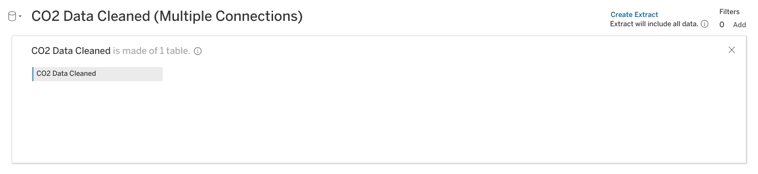
- On CO2 under Connections, find CO2 Data Cleaned and double-click on it to load it.
Your screen should appear similar to the screenshot below:
Adding the other datasets:
-
Click on the energy dataset under Connections.
-
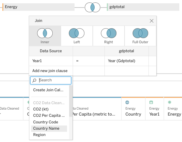
Drag the energy sheet across from the CO2 Data Cleaned box under Multiple Connections. A pop-up window for a Join will appear.
The popup window may automatically populate with Year from CO2 Data Cleaned and Year1 from Energy. If not, put Year on the left side of the chart and Year1 on the right side.
-
Click on Add new join clause under Year. A dropdown menu will appear.
-
Select Country Name on the left side and Country on the right side.
-
Click the X to close the dropdown menu.

- Click Update now to examine the dataset.
You will notice that Year and Year1 have a number sign above them. Change the data type to date for each of these columns.
Join additional datasets
-
Click on gdptotal under Connections.
-
Under Sheets, drag the gdptotal sheet into the white space underneath the energy box.
-
Scroll to the right until you find the column Year(Gdptotal). Click on # above it. A drop-down menu will appear.
-
Select Date from the drop-down menu.
-
Click on the Venn diagram between energy and gdptotal. Click on Add new join clause under year. A drop-down menu will appear.
-
Under CO2 Data Cleaned click on Country Name.
Create a visualization
At the bottom of your screen, you will notice a tab labeled Sheet 1.
-
Click on the tab Sheet1.
-
Drag Country Name under CO2 Data Cleaned into the Detail square.
-
Drag CO2 Per Capita to Color.
-
Click on Color, then Edit Colors.
-
Click on the Palette dropdown and change it from Automatic to Red-Green diverging.
-
Check the boxes for Stepped Color and Reversed. (Because green is generally viewed as positive for CO2 emissions, you want the colors to move towards red as emissions go up.)
-
Click the Show Advanced dropdown.
-
Check the Start and End boxes.
-
Enter 0 into the Start field, and 62 into the End field. Click OK. Click the X button.
Now select Single Value (dropdown). Now the areas are colored only for the values of each year. You can browse any of the years between 2000-2011 to view the emissions for that year.
The result is the world map of CO2 emissions for 2010-2011:

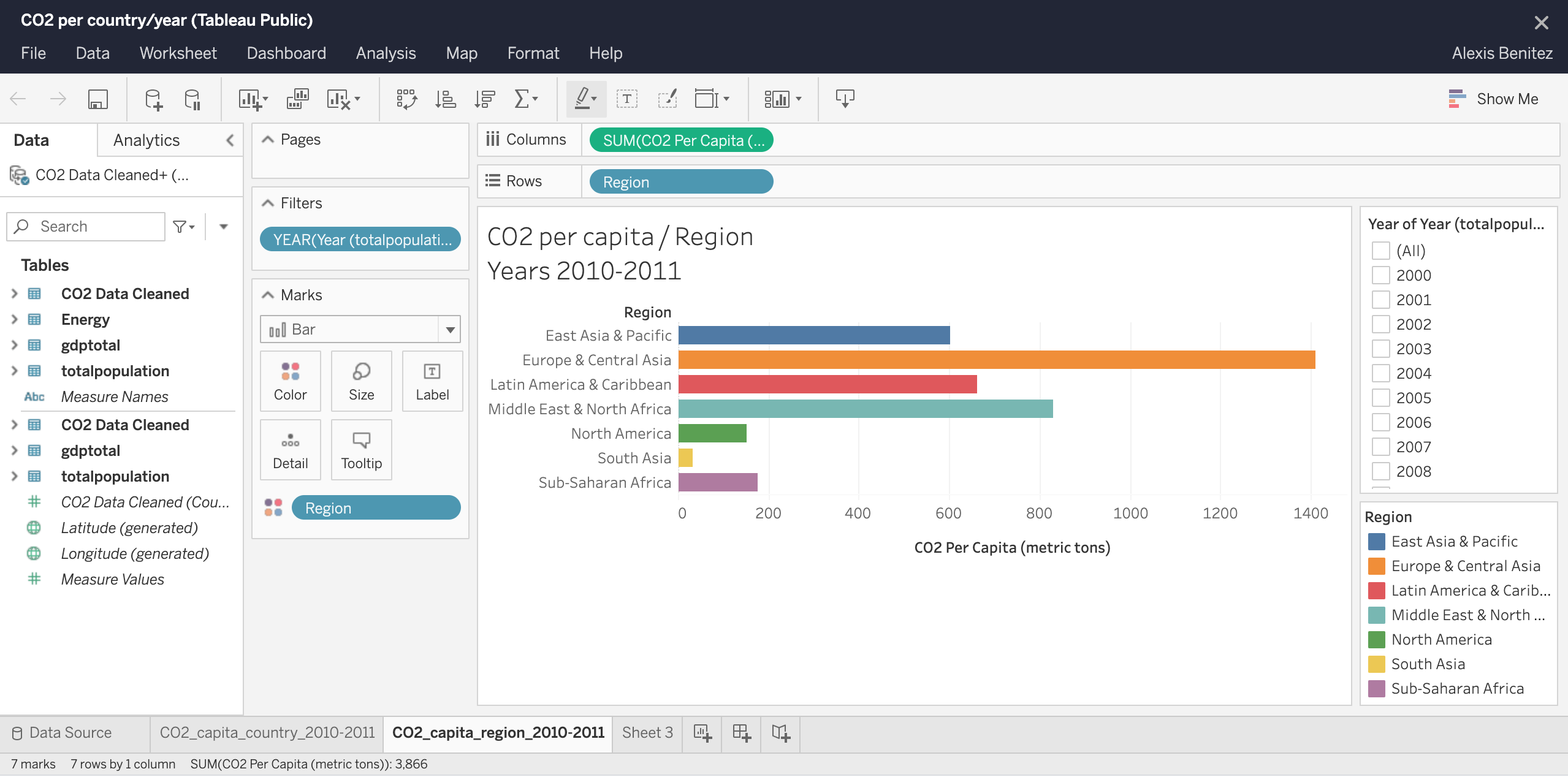
On a second sheet, also added bar graph per region by simply adding CO2 per capita and Region on the top fields Columns and Rows, respectively:
Great! We’ve linked all the data and made a comprehensive data visualization in Tableau.